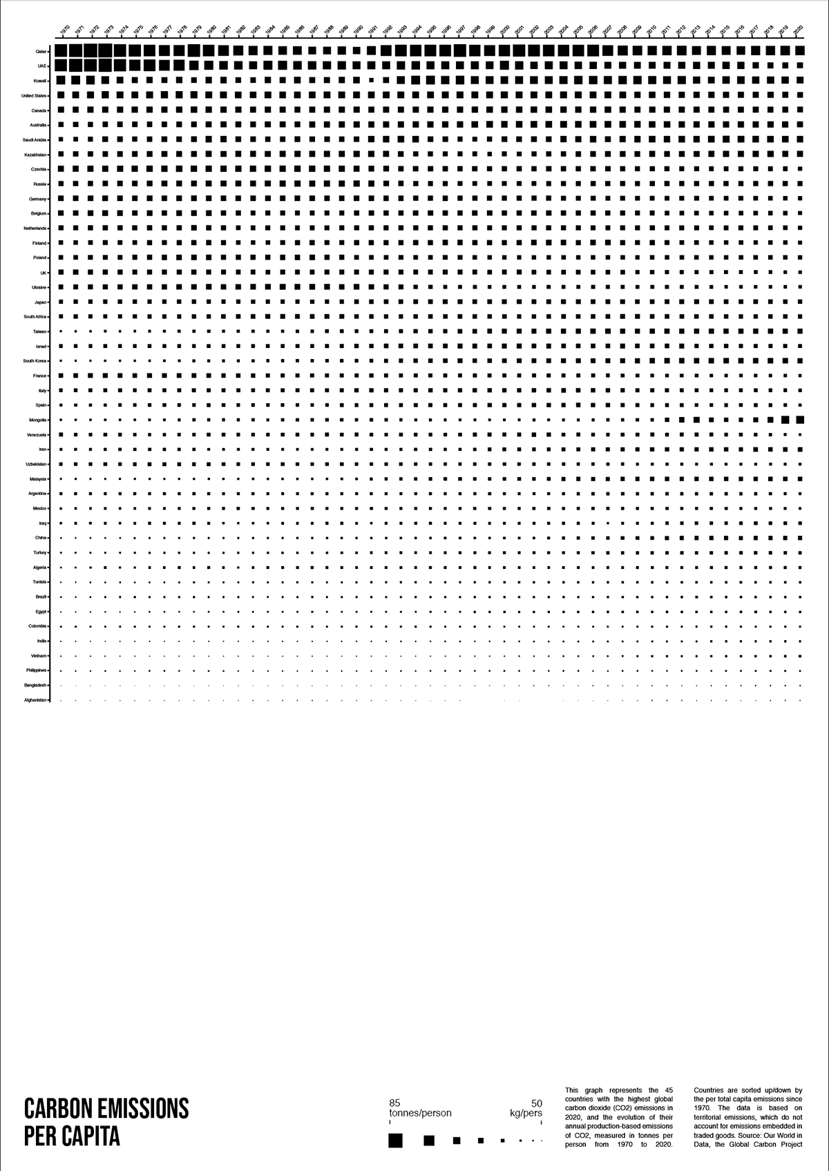

These 5 posters all display the Cardon Dioxide (CO2) emissions per capita of the 45 "most CO2 influent" countries, from 1970 to 2020. Each graph uses a different organisation of the informations, graph types, and different visual cues to transpose the data into a visual media and emphasise a certain viewpoint on the data.
Solo Project, Course "Information Design" with Teacher Federica Fragapane